The Elements of Web Design: Our Glossary to Key Page Components
02/04/2018 | Web Design | 15 minutesWhen it comes to designing your website, there are several key page components to include which are crucial to both the design and function of the site. As a newcomer to the world of web design getting to grips with the jargon can be a challenge, so we’ve compiled this handy glossary to help you learn some of the basic lingo.
Call to action
A section of a web page dedicated to inducing users to perform a certain action, for example clicking on a button to visit a company’s LinkedIn page.
Contact block
A section of a web page which provides the contact details of a business, such as an address, telephone number and email address.
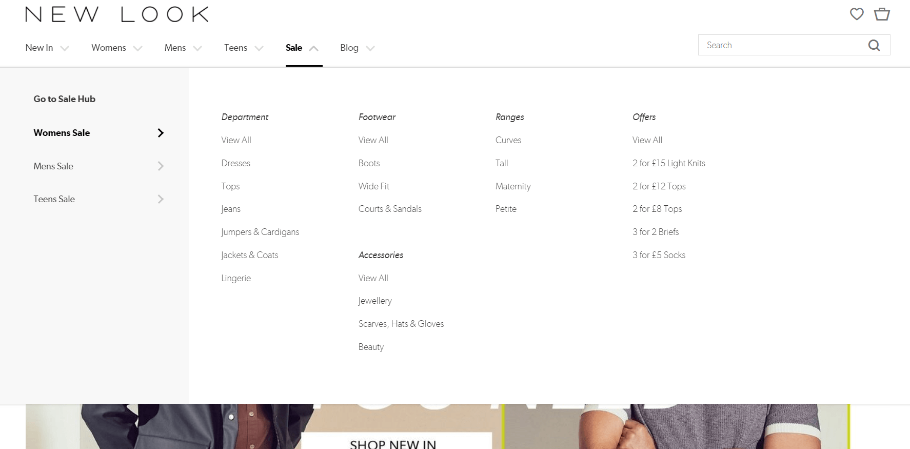
Drop-down menu
A menu which drops down when you hover the mouse over it, typically showing several categories across the top along with clickable options listed below each category. A mega menu is one variation of this which contains a larger number of categories and options to click on.

Favicons
A small icon that appears in certain places on a website and represents your brand, for example alongside the meta title in the tab of a browser and next to the site name when a webpage is bookmarked.
![]()
Footer
A section at the bottom of a website that is present on every page, often containing important technical information, such as the business’s telephone number and links to social media platforms.
Forms
Often forms are required on websites to sign up to a newsletter or submit a request. These contain input fields which are text boxes with space to enter necessary details. These often contain a CAPTCHA, which is a system to ensure that the user is human, rather than a data-collecting computer.
H1, Heading 1
The title of an article, blog post or webpage. Tagging it as h1 in the HTML lets search engines know that this is the main heading of the article, which is vital to successful SEO.
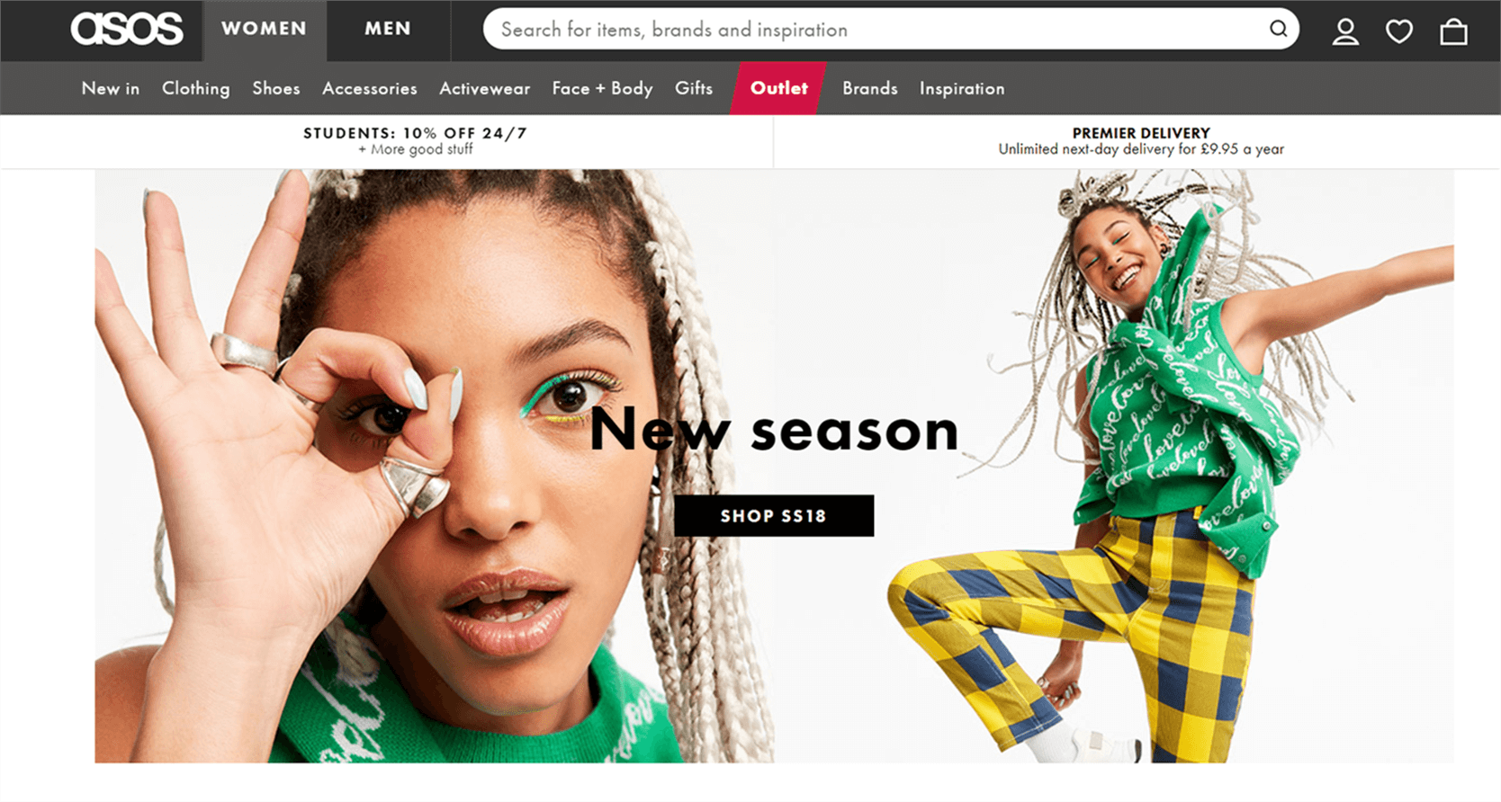
Hero section
The large banner image at the top of a web page, which provides a clear idea of what a company does.

Hyperlink
A link attached to a piece of text or image that when clicked on leads users to another web page. The anchor text is the piece of text that the link is attached to.
Long form content
A longer piece of content that typically contains at least 1,500 words, though this can span to much longer content of, for example, 10,000 words.
Navigation
The element of your website which allows your customers to find the pages they’re looking for without unnecessary clicks or searching.
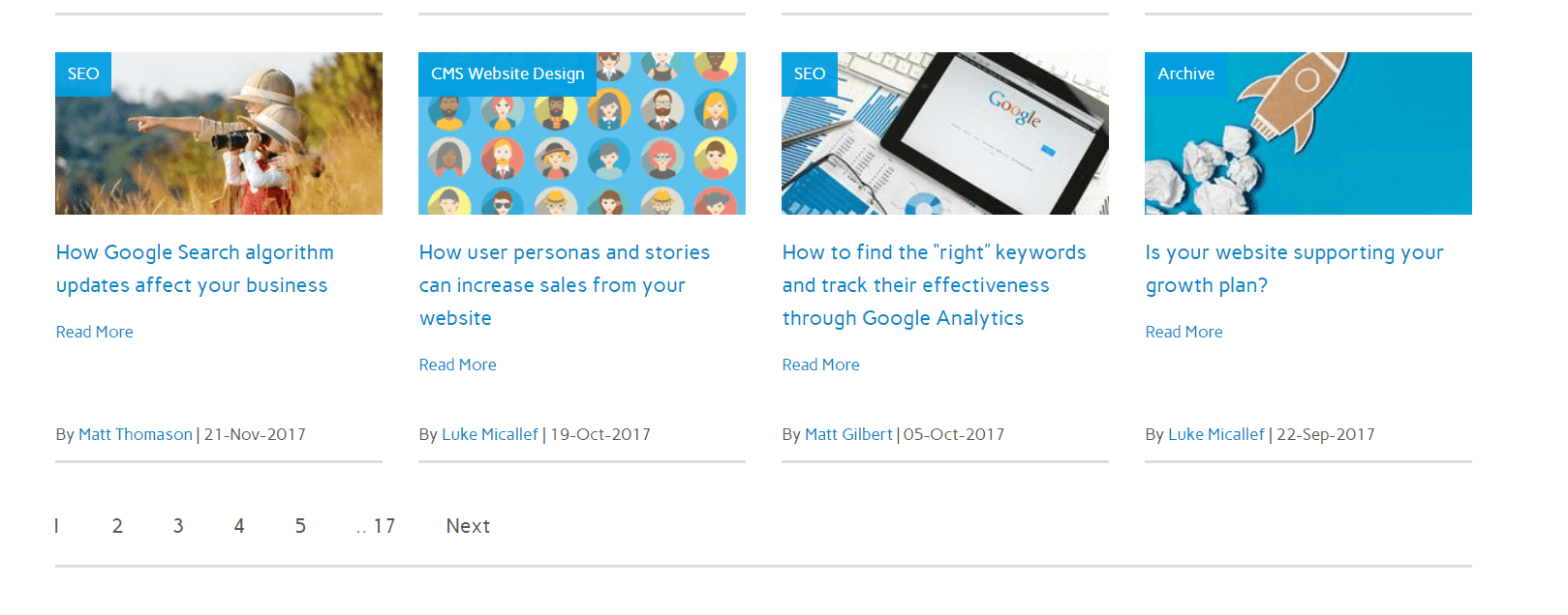
Pagination
Breaking information up in to different pages which are organised by number.

Parallax scrolling
When background images on a web page move slower than foreground images to create an illusion of depth and layering.
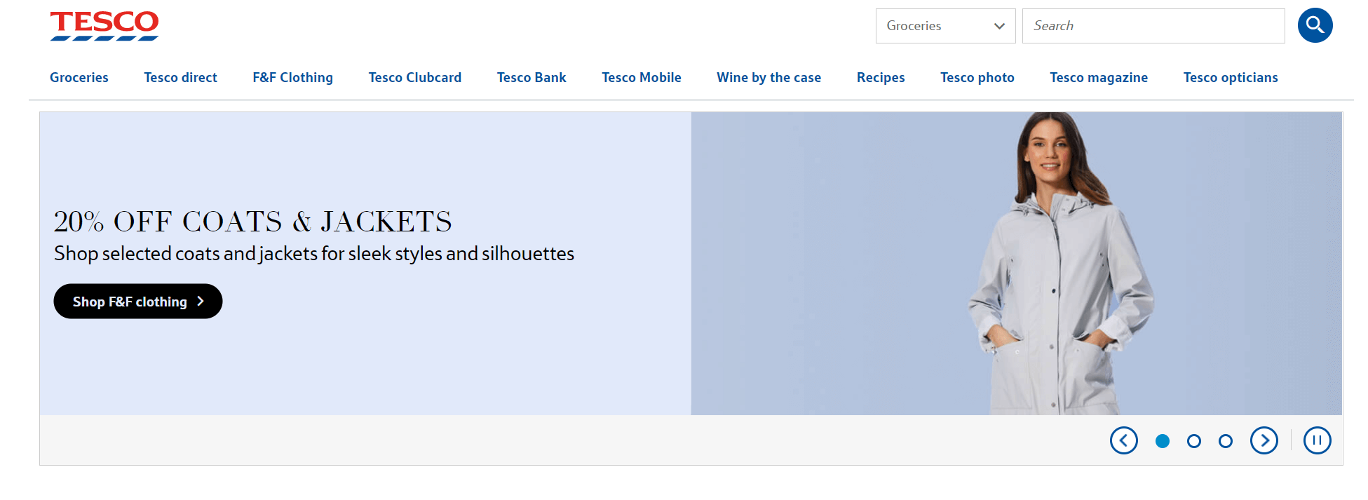
Sliders
A series of still images which can be scrolled between.

White space
The empty space between different elements of a web page. It’s vital to strong design as it improves the readability and digestibility of information.
Z-format
The notion that since the eye automatically follows a Z shape, by placing the most important pieces of information along the line of the Z you can ensure nothing vital is missed, such as critical information or a call to action.


