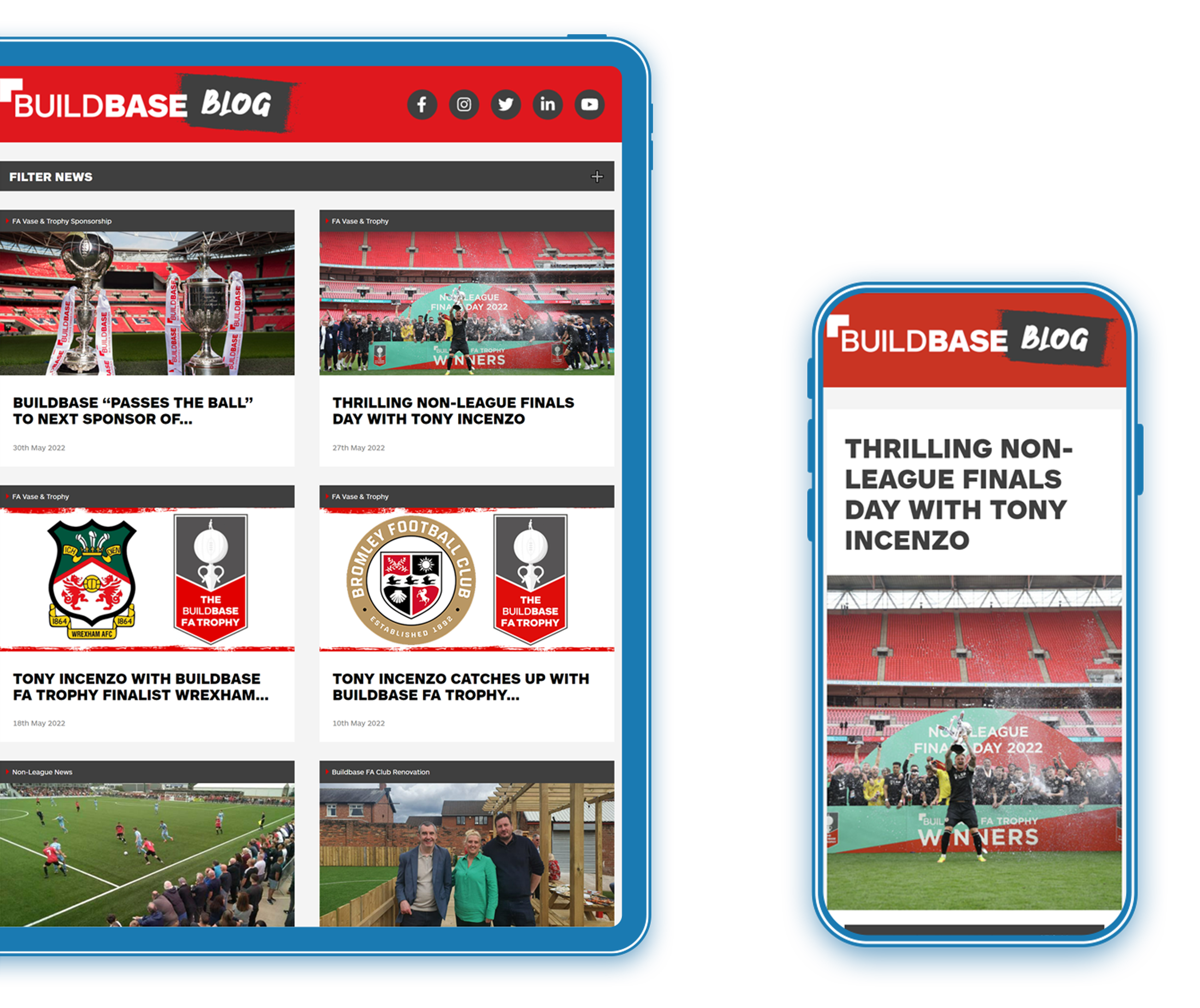
Buildbase is a leading builders’ merchant in the UK, with more than two hundred branches nationwide and e-commerce built into their site to enable sales online.
Their presence online not only drives sales but it’s a crucial tool in developing brand recognition and loyalty. Their blog has long served to offer insights and useful information to their customers. But after many years, it’s lost its flare, and its visitor numbers have plateaued.
Urban Element was tasked with turning their blog around and making it into a powerful web traffic funnel that would help support their e-commerce goals.
When Buildbase came to us, it was with a WordPress-based blog, heavy on text and lacking the UI and UX necessary to really engage readers and inspire them to stay on the site.
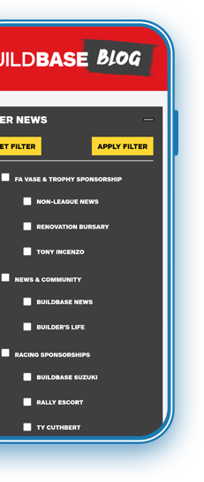
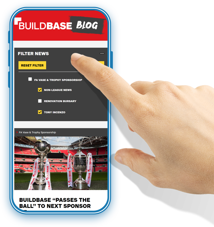
There was no filter system that’s standard in blog sites now. The pages weren’t categorised, and readers eager to find more content had to browse the pages to find what they may be looking for. Bounce rates were high.
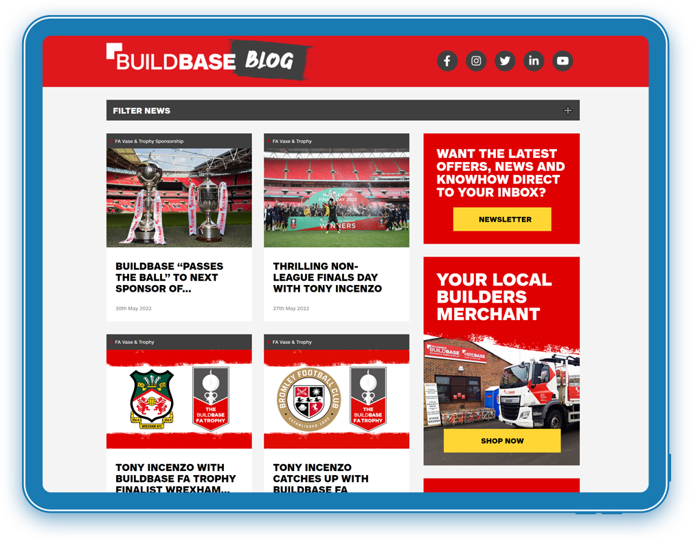
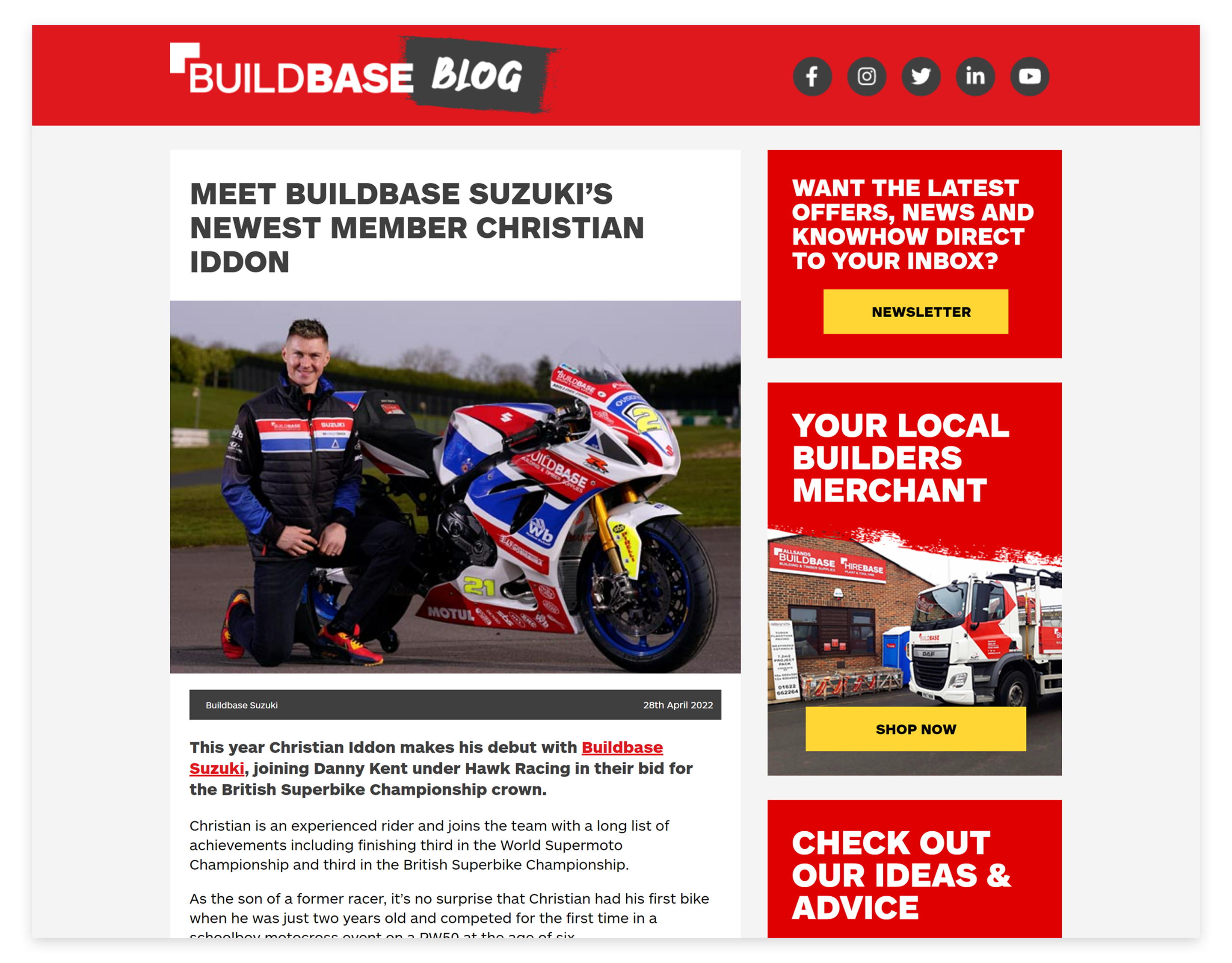
In addition, Buildbase’s blog site didn’t capture the essence of their brand, and it didn’t highlight the incredible sponsorships they have in motorsports and football.
Buildbase was aware of all of this. Their bounce rate was high, and their user experience was not what they wanted it to be. They wanted to modernise their design, highlight their sponsorships and create a user experience that would captivate readers and keep them on the site.
MissionTransform an underperforming blog into a powerful content hub with traffic-boosting benefit
In order to deliver against Buildbase’s expectations, we first conducted an audit of the blog to see where it was underperforming. We looked at the site’s design, the topics being covered, the tone of voice, and the blog’s overall contribution to the rest of the website.
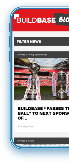
Once we had a clear understanding of where improvements could be made, we set about redesigning the blog from the ground up. We gave it a fresh, modern look to bring it in line with the style of the 2020s.
Using Buildbase’s main website as inspiration, we used the same fonts and colour palette as the main site to create a sense of continuity and visual recognition for users.
From Buildbase’s perspective, we enhanced how the backend of their WordPress site works and functions, allowing them to add blog posts easier and more dynamically.
With the user interface design and backend functionality complete, we designed a user experience that would encourage readers to explore more content on the site.
We achieved this by:
The result was a sleek, modern blog that not only gave users a more enjoyable experience but also met Buildbase’s expectations;
Their new blog — combined with the SEO and Google Ads work we have been doing for Buildbase for three years now — has drastically improved their online performance.